Logo development,
Brand Creation and Extension

"Developing the most appropriate logo for our company wasn't easy, we had no clear idea or concept... so we realised very soon that we really need a profesional! Working with Fru was easy and pleasant.
She conducted us through the whole process with patience and enthusiasm, executing a fantastic looking final project. We are more than thankful for her great work."
Erika Gazda / Csilla Gazda - CEO Gazda Dental
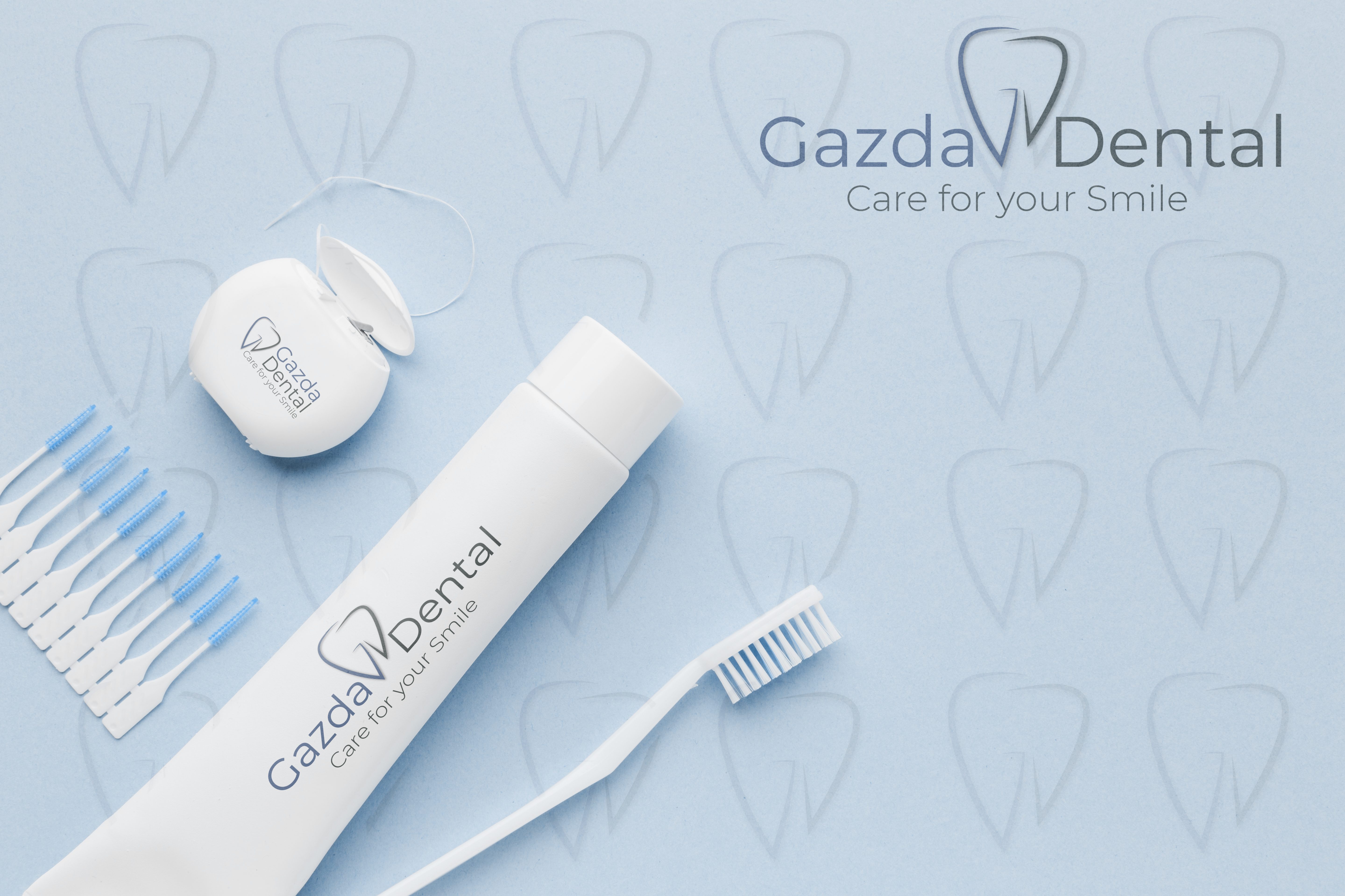
Gazda Dental is a dental clinic owned and run by two sisters, with a very sophisticated taste. At first, the sisters were very hesitant, having no clear idea what they really want. I came up with several ideas until we selected the final design.
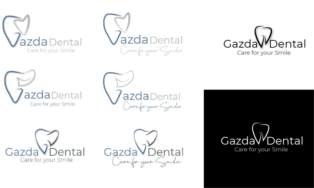
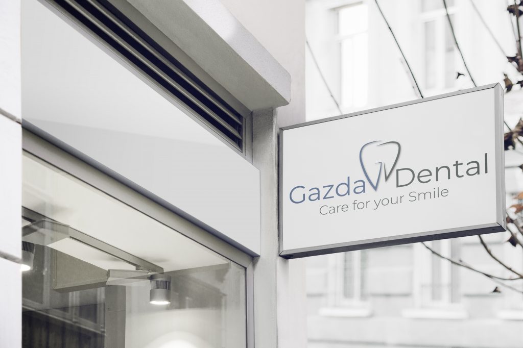
The logo idea was simple and minimalist, exactly as the sisters wished for. I used the combination of the letters G and D in form of a tooth. I used cold colours from the colour palette, expressing the cleanliness and purity of the clinic.
I chose a Sans Serif font for the main text and the sub text of the logo because it gives generally a more modern feeling. Their simplicity gives the logo a basic but professional nonverbal sense.
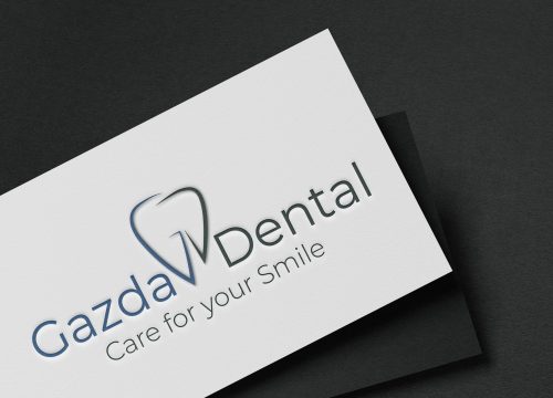
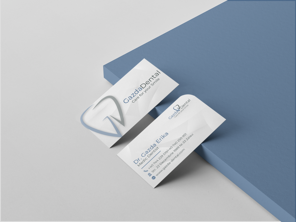
The business card what they wished for, was also a minimalist stile. I made a big watermark, edged on the left corner so it keeps the simplicity still has something unique. On the other side just the main information about them and the logo on the righ corner with the edge reflected from the first side.
